FMP
Beyond P/E: Screening, Scoring, and Ranking Stocks with FMP TTM Ratios API
Jan 03, 2026
Beyond P/E: Screening, Scoring, and Ranking Stocks with FMP TTM Ratios API
Most stock screeners start breaking once you scale past a handful of tickers. Prices move daily, filings update quarterly, and “snapshot” ratios go stale quickly. When you're pulling hundreds of names, small timing mismatches turn into noisy rankings and inconsistent filters.
TTM ratios solve a big part of that. They give you a rolling view of fundamentals that stays closer to current reality, and they make screening more consistent across companies. If you can fetch those ratios in a standardized format for every ticker, you can build a repeatable workflow instead of one-off analysis.
In this guide, we'll use FMP's Financial Ratios TTM endpoint to pull 60+ ratios per company, build a Python screening dataset, and rank stocks using a scoring model you can tweak. By the end, you'll have a clean pipeline that goes from a universe to a ranked shortlist without spreadsheet work.
What you should know about financial ratios
TTM metrics matter because they keep your ratios aligned with how screeners and ranking models actually work. If you're running rules across a large universe, you need inputs that are continuous, comparable, and not overly sensitive to a single quarter's noise. TTM ratios give you that rolling view. They make filters and scores more stable, especially when you're refreshing results often or comparing companies across sectors where seasonality can distort quarter-by-quarter snapshots.
Endpoint Overview
FMP provides the Financial Ratios TTM API, allowing easy access to a broad range of trailing twelve-month metrics for quick and thorough company analysis. This endpoint simplifies obtaining up-to-date financial data through simple HTTP requests, enabling traders and analysts to stay informed with real-time insights for smarter decision-making.
For this API, you should simply provide your FMP token and the company's symbol you are interested in for obtaining the TTM ratios.
|
import requests import pandas as pd import json from typing import Dict, List, Optional token = 'YOUR FMP API KEY' ticket = 'AAPL' url = f'https://financialmodelingprep.com/stable/ratios-ttm' querystring = {"apikey":token, "symbol":ticket} resp = requests.get(url, querystring).json() |
Note: Replace ‘YOUR FMP API KEY' with your secret FMP token. If you don't have one, you can obtain it by opening an FMP developer account.
The reply will be a list of one dictionary as below:
|
[{'symbol': 'AAPL', 'grossProfitMarginTTM': 0.4690516410716045, 'ebitMarginTTM': 0.3206138970254301, 'ebitdaMarginTTM': 0.34872321048824856, 'operatingProfitMarginTTM': 0.31970799762591884, 'pretaxProfitMarginTTM': 0.3189366615324358, 'continuousOperationsProfitMarginTTM': 0.2691506412181824, 'netProfitMarginTTM': 0.2691506412181824, 'bottomLineProfitMarginTTM': 0.2691506412181824, 'receivablesTurnoverTTM': 5.704195622078759, 'payablesTurnoverTTM': 3.1628972230174637, 'inventoryTurnoverTTM': 38.6428821266177, 'fixedAssetTurnoverTTM': 6.817952456626092, 'assetTurnoverTTM': 1.1584451663368045, 'currentRatioTTM': 0.8932929222186667, 'quickRatioTTM': 0.858770399261008, 'solvencyRatioTTM': 0.43329083598358015, 'cashRatioTTM': 0.20249228707186456, 'priceToEarningsRatioTTM': 36.27890581198107, 'priceToEarningsGrowthRatioTTM': 2.7209179358985773, 'forwardPriceToEarningsGrowthRatioTTM': 3.4359075436514206, 'priceToBookRatioTTM': 55.11236813909647, 'priceToSalesRatioTTM': 9.652042838036241, 'priceToFreeCashFlowRatioTTM': 40.66949284194113, 'priceToOperatingCashFlowRatioTTM': 36.45072962451337, 'debtToAssetsRatioTTM': 0.3128178576498785, 'debtToEquityRatioTTM': 1.5241072518411023, 'debtToCapitalRatioTTM': 0.6038203213153511, 'longTermDebtToCapitalRatioTTM': 0.5151090680713661, 'financialLeverageRatioTTM': 4.8721874872852045, 'workingCapitalTurnoverRatioTTM': -22.927085915764536, 'operatingCashFlowRatioTTM': 0.6730744848488508, 'operatingCashFlowSalesRatioTTM': 0.26788190147563085, 'freeCashFlowOperatingCashFlowRatioTTM': 0.8859457132093074, 'debtServiceCoverageRatioTTM': 5.542457453443821, 'interestCoverageRatioTTM': 0, 'shortTermOperatingCashFlowCoverageRatioTTM': 4.9666755769402124, 'operatingCashFlowCoverageRatioTTM': 0.9920357368500672, 'capitalExpenditureCoverageRatioTTM': 8.767754620526937, 'dividendPaidAndCapexCoverageRatioTTM': 3.962254762581746, 'dividendPayoutRatioTTM': 0.1376752075707526, 'dividendYieldTTM': 0.00378899, 'enterpriseValueTTM': 4095641799520, 'revenuePerShareTTM': 27.83964946315684, 'netIncomePerShareTTM': 7.49305950429809, 'interestDebtPerShareTTM': 7.51761046258822, 'cashPerShareTTM': 3.6590293340468945, 'bookValuePerShareTTM': 4.932468140616115, 'tangibleBookValuePerShareTTM': 4.932468140616115, 'shareholdersEquityPerShareTTM': 4.932468140616115, 'operatingCashFlowPerShareTTM': 7.457738234605479, 'capexPerShareTTM': 0.8505870154196074, 'freeCashFlowPerShareTTM': 6.607151219185871, 'netIncomePerEBTTTM': 0.8438999766441395, 'ebtPerEbitTTM': 0.997587373167982, 'priceToFairValueTTM': 55.11236813909647, 'debtToMarketCapTTM': 0.025088106123590675, 'effectiveTaxRateTTM': 0.15610002335586043, 'enterpriseValueMultipleTTM': 28.22147665474591, 'dividendPerShareTTM': 1.03}] |
Most Commonly Used Ratios
Let's explain the most commonly used, grouped by area of financial analysis:
Profitability Margins
- Gross profit margin (grossProfitMarginTTM): Revenue minus COGS percentage.
- EBIT margin (ebitMarginTTM): Operating income over revenue.
- EBITDA margin (ebitdaMarginTTM): Earnings before interest, taxes, depreciation.
- Operating profit margin (operatingProfitMarginTTM): Operating income to revenue ratio.
- Net profit margin (netProfitMarginTTM): Bottom-line profit to revenue
Efficiency Ratios
- Receivables turnover (receivablesTurnoverTTM): Sales divided by receivables.
- Inventory turnover (inventoryTurnoverTTM): COGS over average inventory.
- Asset turnover (assetTurnoverTTM): Revenue per total assets.
Liquidity Ratios
- Current ratio (currentRatioTTM): Current assets over liabilities.
- Quick ratio (quickRatioTTM): Liquid assets to current liabilities.
- Cash ratio (cashRatioTTM): Cash to current liabilities.
Solvency & Leverage
- Debt to equity (debtToEquityRatioTTM): Total debt over equity.
- Financial leverage (financialLeverageRatioTTM): Assets to equity multiple.
- Interest coverage (interestCoverageRatioTTM): EBIT to interest expense.
Valuation Multiples
- Price to earnings (priceToEarningsRatioTTM): Stock price per EPS.
- Price to book (priceToBookRatioTTM): Market price over book value.
- PEG ratio (priceToEarningsGrowthRatioTTM): P/E divided by growth rate.
Cash Flow & Per Share
- Operating cash flow per share (operatingCashFlowPerShareTTM): OCF divided by shares.
- Free cash flow per share (freeCashFlowPerShareTTM): FCF per share outstanding.
- Dividend payout (dividendPayoutRatioTTM): Dividends to net income ratio.
For more detailed analysis, readers can examine the API's over 60 specialised TTM metrics, such as debtServiceCoverageRatioTTM (which assesses debt repayment capacity from cash flows) or capitalExpenditureCoverageRatioTTM (which evaluates the ability to fund capital expenditure). These metrics provide a deeper understanding of cash flow sustainability and how efficiently investments are working, going beyond just basic profitability or valuation ratios. They offer valuable nuances that can support more advanced trading strategies.
Are those ratios the only ones you need?
Despite the fact that there are over 60 ratios provided from the API, there are also other ratios that can be computed using the ones returned from the API. The list can be endless, so lets see some of the most common ones:
|
item = resp[0] # Basic valuation enhancements pe = item["priceToEarningsRatioTTM"] earnings_yield = 1 / pe fcf_yield = 1 / item["priceToFreeCashFlowRatioTTM"] peg = pe / item["priceToEarningsGrowthRatioTTM"] # Profitability / return roe = item["netIncomePerShareTTM"] / item["shareholdersEquityPerShareTTM"] roa = item["netProfitMarginTTM"] * item["assetTurnoverTTM"] # Cash & leverage net_debt_per_share = item["interestDebtPerShareTTM"] - item["cashPerShareTTM"] net_debt_to_fcf_ps = net_debt_per_share / item["freeCashFlowPerShareTTM"] cash_to_equity_ps = item["cashPerShareTTM"] / item["shareholdersEquityPerShareTTM"] print(f"Earnings Yield (TTM): {earnings_yield:.2%}") print(f"PEG (TTM): {peg:.2f}") print(f"ROE (TTM): {roe:.2%}") print(f"ROA (TTM): {roa:.2%}") print(f"Net debt per share: {net_debt_per_share:.2f}") print(f"Net debt / FCF per share: {net_debt_to_fcf_ps:.2f}") print(f"Cash / Equity per share: {cash_to_equity_ps:.2%}") |
If you run the above Python code, you will get, in our case, the following output:
|
Earnings Yield (TTM): 2.76% PEG (TTM): 13.33 ROE (TTM): 151.91% ROA (TTM): 31.18% Net debt per share: 3.86 Net debt / FCF per share: 0.58 Cash / Equity per share: 74.18% |
Derived ratios are often more useful than raw ratios when you start ranking a large universe, because they normalize the same idea into a more comparable signal. For example, yields turn valuation multiples into something you can score in one direction, and net-debt style ratios help separate balance sheet risk from profitability. These small transformations make your ranking rules cleaner and more consistent across sectors and market caps.
Also, watch out for extreme values. A very high ROE can be a genuine sign of strong profitability, but it can also happen when equity per share is unusually small, which inflates the ratio. The same applies to anything that has a small denominator, so it's worth adding simple guards like clipping outliers or setting minimum thresholds before feeding these numbers into a scoring model.
The ratios that we have computed are serving a lot of aspects of financial analysis as below:
Profitability & Returns
- Earnings yield (TTM): Earnings power relative to stock price.
- ROE (TTM): Net income divided by shareholders' equity.
- ROA (TTM): Net income over total assets efficiency.
Valuation & Growth
- PEG (TTM): P/E ratio normalized by earnings growth.
Debt & Leverage
- Net debt per share: Total net debt divided by shares.
- Net debt / FCF per share: Leverage against free cash flow.
Liquidity Position
- Cash / Equity per share: Cash holdings relative to equity value.
Add the ratios to a stock screener
In addition to evaluating individual companies, integrating these ratios into a screener is an excellent way to enhance your toolkit for identifying investment opportunities. Typically, investors use screeners to find companies that align well with their investment strategies.
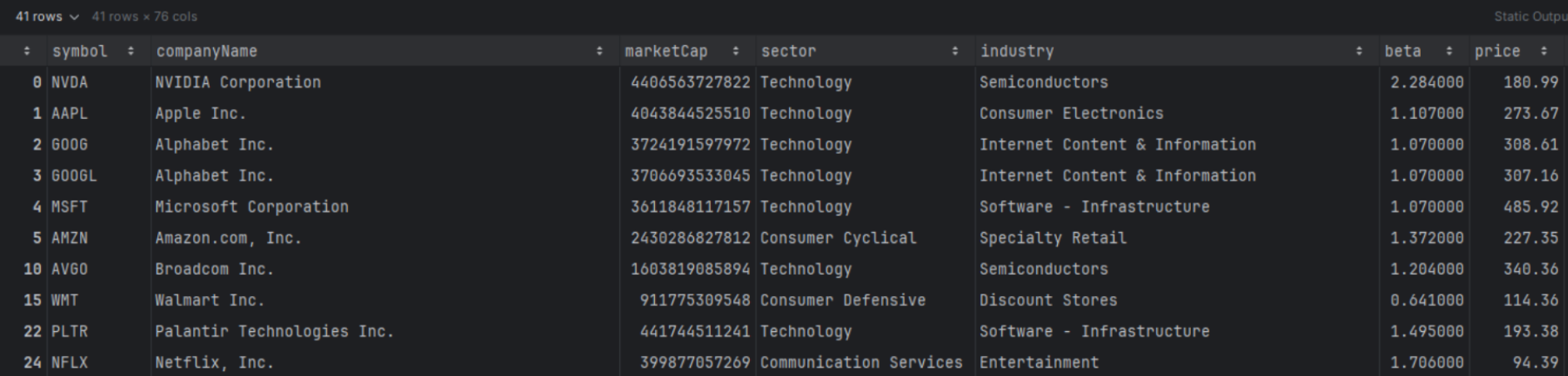
FMP offers the Stock Screener API, which allows you to easily find companies using different filters. In the example below, we will use the screener API to identify US companies with a capitalization of over 10 billion, further narrowing the list to those traded on NASDAQ.
Note: This universe choice is intentional, but it's not a rule. Large-cap NASDAQ names give us a liquid, well-covered set of companies where ratio data is usually consistent, and the list size stays manageable for a first pass. In real workflows, universe construction is part of the strategy. You might filter by sector, exclude financials, focus on a specific country, or build a watchlist-driven universe. Treat this as a template you can reshape based on what you are trying to rank.
It's worth noting that this workflow assumes access to the exchange query parameter in the Stock Screener API. Filtering directly by exchange at query time requires a higher-tier FMP account, and it becomes important once you start defining tighter universes instead of relying on broader post-filters.
At an organizational level, this same approach can be reused across teams to standardize how universes are defined, screened, and ranked. Instead of ad hoc spreadsheets, teams can rely on a shared, code-based model that refreshes automatically as new data arrives.
|
url = f'https://financialmodelingprep.com/stable/company-screener' querystring = {"apikey": token, "marketCapMoreThan": 10_000_000_000, "country": "US"} resp = requests.get(url, querystring).json() df_screener = pd.DataFrame(resp) df_screener = df_screener[df_screener['exchangeShortName'] == 'NASDAQ'] list_of_tickers = df_screener['symbol'].to_list() |
When we used this filter, we got 312 companies.
Following that, we are going to call for each company, the TTM Ratios API, add all the ratios from this API, and additionally add ROE and PEG from the additional ratios that we discussed before, and how they can be calculated
|
ratios_list = [] for symbol in list_of_tickers: url_ratios = f'https://financialmodelingprep.com/stable/ratios-ttm' resp_ratios = requests.get(url_ratios, {"apikey": token, "symbol": symbol}).json() if resp_ratios: item = resp_ratios[0] item['symbol'] = symbol # Calculate ROE and PEG manually if the columns exist if 'netIncomePerShareTTM' in item and 'shareholdersEquityPerShareTTM' in item and (item["shareholdersEquityPerShareTTM"] != 0): item['roe'] = item["netIncomePerShareTTM"] / item["shareholdersEquityPerShareTTM"] else: item['roe'] = None if 'priceToEarningsRatioTTM' in item and 'priceToEarningsGrowthRatioTTM' in item and (item["priceToEarningsRatioTTM"] != 0): item['peg'] = item["priceToEarningsRatioTTM"] / item["priceToEarningsGrowthRatioTTM"] ratios_list.append(item) df_ratios = pd.DataFrame(ratios_list) df = df_screener.merge(df_ratios, on='symbol', how='left') df |
Filter the Universe with Your First Rule Set
So now we have our screener dataframe enhanced with all the TTM ratios, as well as the precomputed ROE and PEG. With this dataframe, we can easily filter to identify stocks based on our preferences. Let's try an example.
|
df_filtered = df.copy() df_filtered = df_filtered[(df_filtered['peg'] > 1.5) & (df_filtered['roe'] > 0.15)] df_filtered |
When you apply a filter like this, you'll usually notice a very specific mix of names showing up. High ROE tends to pull in businesses that are already efficient at converting equity into profits, while a higher PEG threshold pushes you toward companies where the market is still pricing in growth, often at a premium. The interesting part is the tension between the two. You end up with stocks that look fundamentally strong, but not necessarily cheap. That's a useful lens if your goal is to study “quality at a price” setups, or to surface candidates where profitability is strong enough that the market is willing to pay up.
Rank Instead of Manually Reviewing the List
This filter gave us 41 companies, which is still too many to review manually. This is where ranking helps. Filters are binary. They either include or exclude. Ranking is more flexible because it lets you compare companies on a spectrum and surface the best trade-offs, even when no stock is perfect on every metric. The idea is simple. Convert each metric into a comparable score, apply weights based on what you care about, then sort.
Different weights reflect different styles. A heavier PEG weight favors “growth at a reasonable price” preferences, while a heavier ROE weight leans toward quality and profitability. In the example below, we'll weight PEG at 60% and ROE at 40% and produce a top 10 shortlist.
|
w_peg = 0.6 # weight for PEG (cheaper is better) w_roe = 0.4 # weight for ROE (higher is better) df_screen = df.dropna(subset=["peg", "roe"]).copy() df_screen = df_screen.query("peg > 0 and peg < 100") # Ranks df_screen["rank_peg"] = df_screen["peg"].rank(method="average", ascending=True) # low PEG best df_screen["rank_roe"] = df_screen["roe"].rank(method="average", ascending=False) # high ROE best # Normalize to 0-1 df_screen["rank_peg_norm"] = df_screen["rank_peg"] / df_screen["rank_peg"].max() df_screen["rank_roe_norm"] = df_screen["rank_roe"] / df_screen["rank_roe"].max() # Invert so best ≈ 1, worst ≈ 0 df_screen["peg_score"] = 1 - df_screen["rank_peg_norm"] df_screen["roe_score"] = 1 - df_screen["rank_roe_norm"] # Weighted total score (higher is better) df_screen["score"] = ( w_peg * df_screen["peg_score"] + w_roe * df_screen["roe_score"] ) top10 = df_screen.sort_values("score", ascending=False).head(10) top10[["symbol", "sector", "peg", "roe", "score"]] |
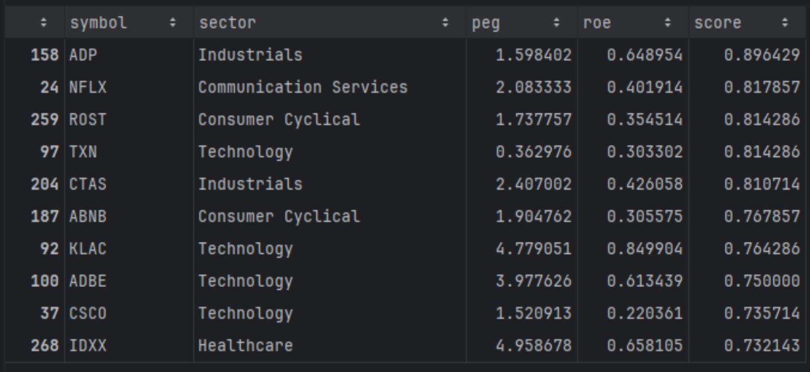
The top results here are the names that sit in the middle of the trade-off. They are profitable enough to score well on ROE, but not so expensively priced that PEG dominates the score. If you change the weights, you'll see the list shift immediately. That's the real value of this setup. It turns screening into a repeatable, style-driven ranking workflow instead of a one-off filter.
In our case the screener's filters we have implemented is quite basic, based mostly on the market capitalization. If you want to get it to the next level you can read the article “How to Find Company and Exchange Symbols with FMP and Discover What's Behind Them”, to master how to build the universe of stocks that you can add using the code above, the financial ratios.
Do we compare apples with apples?
Well, a one-size-fits-all approach works for general screening but misses vital context for fair comparisons, like pitting tech giants against utilities. Filtering by sector ensures you're comparing apples to apples, as industries vary wildly in norms for ROE, PEG, and margins due to differing business models and capital needs.
Using the same screener dataframe, you can see the code below where we can do some more advanced filtering and ranking on the same sector.
|
def rank_stocks( df: pd.DataFrame, weights: Dict[str, float], filters: Optional[List[str]] = None, top_n: int = 10, ascending_pref: Optional[Dict[str, bool]] = None, ) -> pd.DataFrame: df_screen = df.copy() if filters: for q in filters: df_screen = df_screen.query(q) # Drop rows with NaNs in any weighted column cols = list(weights.keys()) df_screen = df_screen.dropna(subset=cols) if df_screen.empty: raise ValueError("No rows left after filtering and NaN removal.") if ascending_pref is None: ascending_pref = {col: (col.lower() == "peg") for col in cols} # Build scores per metric for col in cols: asc = ascending_pref.get(col, False) # default: higher is better rank_col = f"rank_{col}" norm_col = f"{col}_norm" score_col = f"{col}_score" df_screen[rank_col] = df_screen[col].rank(method="average", ascending=asc) # Normalize df_screen[norm_col] = df_screen[rank_col] / df_screen[rank_col].max() # Invert so that higher is better (≈1 best, 0 worst) df_screen[score_col] = 1 - df_screen[norm_col] # Weighted total score score_expr = " + ".join( f"{weights[col]} * df_screen['{col}_score']" for col in cols ) df_screen["score"] = eval(score_expr) df_screen = df_screen.sort_values("score", ascending=False) return df_screen.head(top_n) weights = {"peg": 0.6, "roe": 0.4} filters = [ "sector == 'Technology'", "peg > 0", "peg < 100", ] top10 = rank_stocks(df, weights=weights, filters=filters, top_n=10) top10[["symbol", "sector", "peg", "roe", "score"]] |
Before we look at the results, it's worth calling out why this approach is slightly more involved than a simple global ranking. A single score across the full universe can introduce structural bias. Some sectors naturally trade at higher multiples, and some industries tend to run with very different ROE profiles. If you rank everything together, you often end up rewarding sector effects rather than company quality.
By normalizing and scoring within sectors, you're comparing companies against their closest peers first, then pulling out the relative winners from each industry. That makes the shortlist more balanced and usually more useful, because it surfaces companies that are strong for their category, not just the ones that look good because their sector's typical ratios happen to fit your scoring rules.
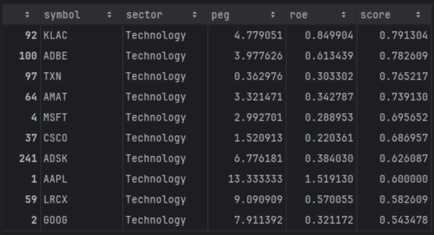
The resulting top-10 list highlights technology names that best balance growth expectations and profitability within their sector, rather than across the entire market. Companies like KLA Corporation (KLAC), Adobe (ADBE), Texas Instruments (TXN), and Microsoft (MSFT) stand out because they combine strong returns on equity with growth valuations that remain reasonable relative to their tech peers, forming a concentrated basket of higher-quality growth candidates.
Ranking Across Sectors
At this point, the goal is to rank within each sector first, then combine the winners into one shortlist. This changes the selection logic. Instead of letting one sector dominate the top of the list because it naturally scores well on your metrics, you force the model to surface the strongest names inside each peer group, then compare those peer winners against each other.
|
# Unique sectors in the original universe sectors = df["sector"].dropna().unique() weights = {"peg": 0.6, "roe": 0.4} all_top = [] for s in sectors: filters = [ f"sector == '{s}'", "peg > 0", "peg < 100", "marketCap > 1e9", ] try: top_sector = rank_stocks( df, weights=weights, filters=filters, top_n=10 ) all_top.append(top_sector) except ValueError: # No rows for this sector after filtering - skip continue # Concatenate all sector top-10s top_by_sector = pd.concat(all_top, ignore_index=True) global_top10 = top_by_sector.sort_values("score", ascending=False).head(10) global_top10[["symbol", "sector", "peg", "roe", "score"]] |
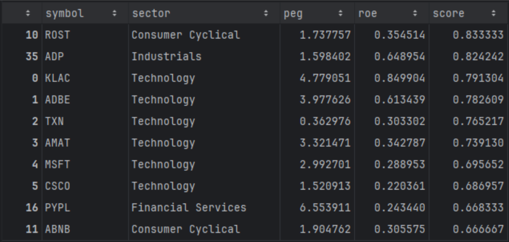
When you compute rankings sector by sector first, the shortlist becomes more “peer relative.” Companies that were previously pushed down by cross-sector differences can move up because they are now competing against businesses with similar fundamentals and typical valuation ranges. You will often see names appear that are clear leaders within their category, even if their raw multiples would look less attractive when compared to the entire market. This approach is preferable when you want a balanced shortlist and you want your ranking to reflect relative strength within industries, not sector-level structure.
Let's do some plotting
What will be interesting is to plot the average PEG per sector and explain the results:
|
import matplotlib.pyplot as plt # 1. Compute average PEG per sector sector_peg = ( df .dropna(subset=["sector", "roe"]) .groupby("sector")["roe"] .mean() .sort_values() # optional: sort from lowest to highest PEG ) # 2. Plot as bar chart plt.figure(figsize=(10, 6)) sector_peg.plot(kind="bar") plt.ylabel("Average PEG (TTM)") plt.xlabel("Sector") plt.title("Average PEG by Sector") plt.xticks(rotation=45, ha="right") plt.tight_layout() plt.show() |
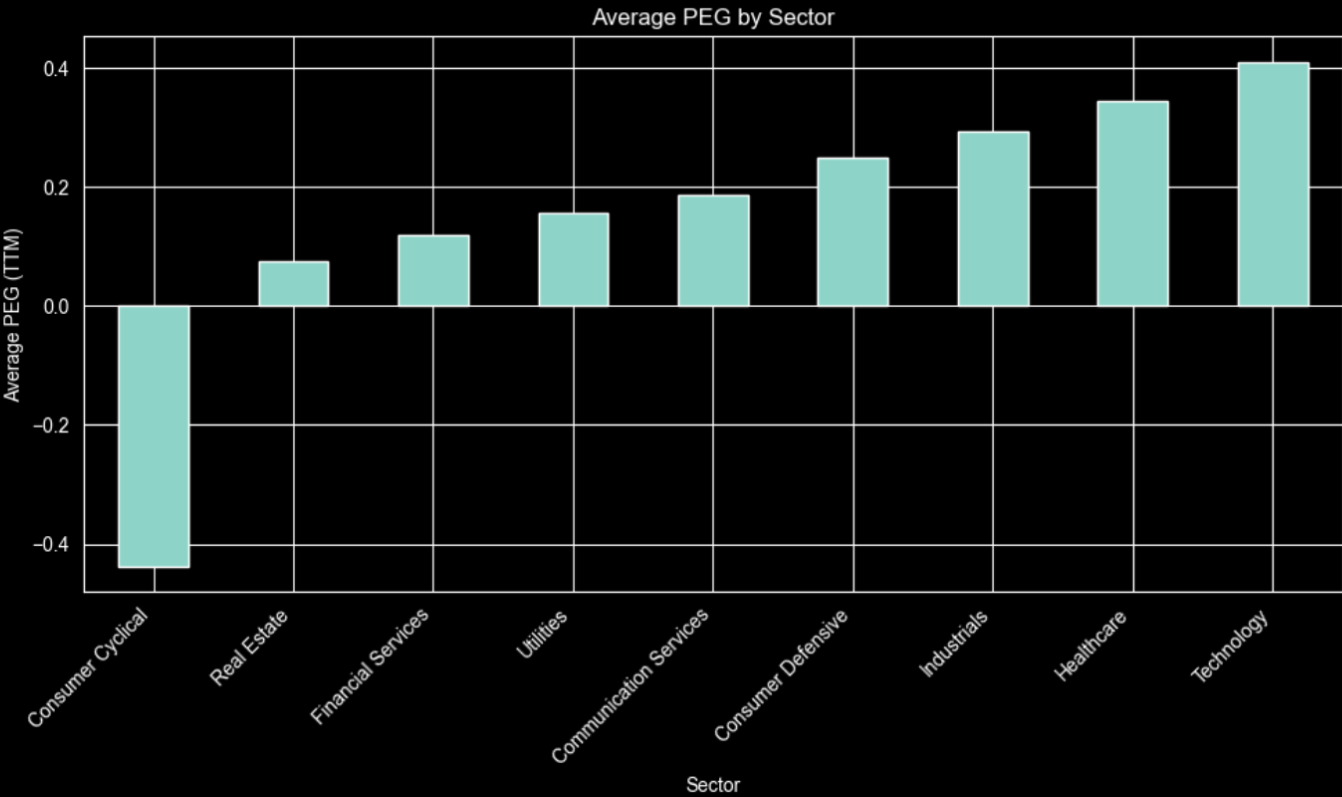
The chart shows Technology and Healthcare at the high end and Consumer Cyclical negative, indicating cheap or contracting growth.For example, high‑growth tech justifies richer PEGs, while utilities or financial services grow slowly and typically trade at lower, more regulated valuations.
One more interesting information is to see if there are any correlations between some ratios. We will select the most important ones not to get ovewhelemed with the result:
|
import seaborn as sns import matplotlib.pyplot as plt # Select relevant numeric columns cols = [ "priceToEarningsRatioTTM", "priceToSalesRatioTTM", "priceToFreeCashFlowRatioTTM", "peg", # if present "roe", # if present "grossProfitMarginTTM", "netProfitMarginTTM", "debtToEquityRatioTTM", "currentRatioTTM", ] corr = df[cols].corr() plt.figure(figsize=(10, 8)) sns.heatmap( corr, annot=True, fmt=".2f", cmap="coolwarm", center=0, linewidths=0.5 ) plt.title("Correlation Matrix of Key Ratios") plt.tight_layout() plt.show() |
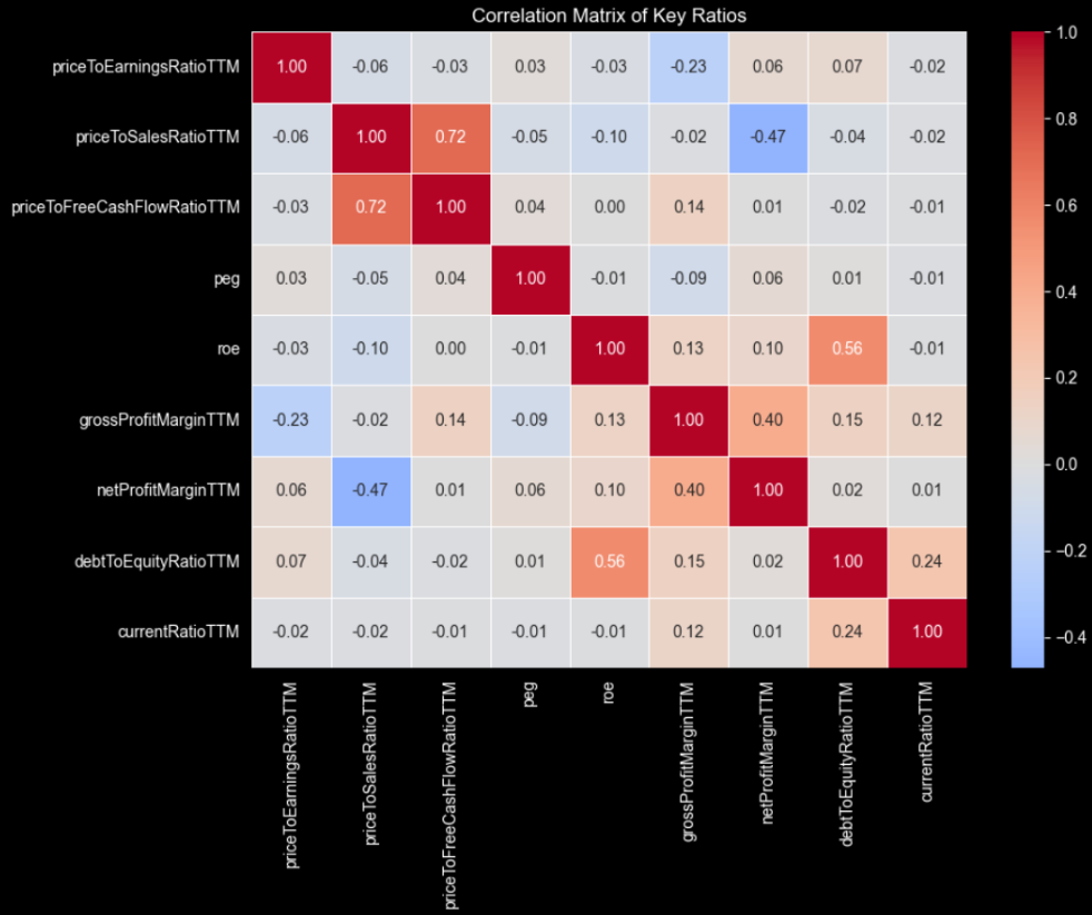
Not a lot of correlations at high numbers but still some interesting to discuss.
Price-to-sales and price-to-free-cash-flow are strongly related, so they naturally move together when revenue growth translates into higher cash generation. A business that scales efficiently usually converts a larger share of sales into free cash flow, making investors willing to pay more per unit of both sales and cash flow.
ROE with debt-to-equity and profit margins are also correlated, hinting that leverage can boost returns. PEG appears largely independent, confirming it adds distinct information beyond traditional valuation and profitability metrics when ranking companies.
Final Thoughts
The Financial Ratios TTM API from FMP truly shines when incorporated into a screener and ranking process. It brings together numerous up-to-date profitability, leverage, and valuation metrics into one reliable source. This not only makes data handling easier but also allows you to spend more time designing rules, setting weights, and making sector-aware comparisons, instead of constantly rebuilding inputs for each backtest or idea.
It would also be more than interesting to incorporate into this fundamental analysis some technical metrics. An article that can help you to get started is “How to Combine Fundamentals and Technicals: Building a Hybrid Screening Model with FMP APIs”, where you can understand better how to use the best of both worlds.
Readers should experiment with TTM ratios, beginning with simple filters like PEG and ROE, then moving to sector-normalized scores, custom weights, and cash-flow or balance-sheet constraints. Using live and historical FMP data helps refine these rules to find robust, rules-based stock selection frameworks tailored to each investor's risk tolerance and style.
This is the real “beyond P/E” step. Turning TTM ratios into a repeatable, sector-aware, rules-based screening and ranking model that you can run anytime on fresh data.
FAQs
1. What is the Financial Ratios TTM API and what does it return?
FMP's Financial Ratios TTM API returns trailing twelve month ratios for a company in a single response, covering profitability, valuation, liquidity, leverage, cash flow, and per-share metrics. It's designed to give you a current fundamentals snapshot that can plug directly into screeners and ranking models.
2. Why use TTM ratios instead of annual or quarterly ratios for screening?
TTM ratios are more stable for rules-based screening because they reflect the most recent twelve months of performance, not a single quarter or a year-old filing. That makes comparisons cleaner when you're ranking large universes and refreshing results regularly.
3. How do you build a stock screener using financial ratios in Python?
A practical workflow is to define your universe with a screener endpoint, fetch TTM ratios for each ticker, merge the data into one dataframe, then apply filters and a scoring function. From there, you can rank stocks by weighting metrics like ROE, valuation multiples, and leverage constraints.
4. What's the best way to rank stocks using financial ratios?
Ranking works better than hard filters when you want a shortlist that captures trade-offs across valuation and profitability. A common approach is to normalize each metric across the universe or within sectors, convert them into scores, apply weights based on your style, then sort by the final score.
5. How do you avoid misleading ratio signals like extreme ROE or PEG values?
Extreme values often come from edge cases like tiny denominators, one-time effects, or outliers that distort ranking. Basic guards like removing invalid ranges, setting minimum thresholds, and clipping outliers, plus sector-aware scoring, help keep the model robust.

WACC vs ROIC: Evaluating Capital Efficiency and Value Creation
Introduction In corporate finance, assessing how effectively a company utilizes its capital is crucial. Two key metri...

BofA Sees AI Capex Boom in 2025, Backs Nvidia and Broadcom
Bank of America analysts reiterated a bullish outlook on data center and artificial intelligence capital expenditures fo...

Pinduoduo Inc. (PDD) Q1 2025 Earnings Report Analysis
Pinduoduo Inc., listed on the NASDAQ as PDD, is a prominent e-commerce platform in China, also operating internationally...