FMP
Congressional Trading Tracker: How to Identify Top Politicians, Top Stocks, and High-Volume Trades Using FMP’s Senate & House APIs
Dec 15, 2025(Last modified: Dec 22, 2025)
Congressional Trading Tracker: How to Identify Top Politicians, Top Stocks, and High-Volume Trades Using FMP's Senate & House APIs
Introduction
Insider trading occurs when individuals buy or sell securities using confidential, material information, giving them an unfair advantage over the public. In the case of Congress members, this is particularly controversial. They often have access to policy details, budget decisions, and committee insights that can move entire sectors before the information goes public. To address this, the 2012 STOCK Act mandates lawmakers to disclose trades exceeding $1,000 within 45 days. But with loose enforcement and minimal penalties, it's more of a paper rule than a deterrent.
Still, these disclosures are a goldmine. They reveal which politicians are actively trading, which companies or sectors they're focusing on, and how their activity shifts around major policy moves. For some, it's about transparency. For others, it's a signal. One more data stream to factor into macro positioning or risk alerts.
In this article, we'll use FMP's suite of APIs to replicate some of the most interesting features found on platforms like StockInvest.us. We'll identify top traders and most active stocks, measure sector-level trading trends, and build simple screens for high-volume political trades.
Public Platforms and Prebuilt Dashboards
There are several notable platforms that compile data on insider and congressional trading activity. These tools typically offer searchable dashboards where users can browse trade disclosures, examine buy and sell volumes, and monitor the market activity of corporate insiders and U.S. lawmakers. Some also provide curated views of top trades or active politicians, making it easier to scan for potentially interesting patterns.
What if you had the data in hand?
Relying on prebuilt dashboards means you're seeing the same cuts of data that thousands of others are. The real edge comes from customizing the analysis yourself. With direct API access, you can run your own filters, segment trades in ways that align with your strategy, and uncover overlooked patterns that static platforms might miss.
In this article, we will show you how to access the data from FMP's suite of APIs and conduct your own analysis. But first, let's begin with our imports.
|
import requests import pandas as pd import json import matplotlib.pyplot as plt import numpy as np import time token = 'YOUR FMP TOKEN' |
Note: Before you proceed, make sure to have your own secret FMP API key. If you don't have one, you can easily it obtain it by opening an FMP developer account.
The first API we will introduce is the FMP's Latest Senate Financial Disclosures API.
|
url = f'https://financialmodelingprep.com/stable/senate-latest' querystring = {"apikey":token, "limit": 100} resp = requests.get(url, querystring).json() df = pd.DataFrame(resp) df.head() |
This API takes parameters for the limit (how many results you want in your response) and the page number. So, if you want to skip the first page (which is numbered 0), with a limit of 100 per response, you need to pass page as 1 and limit as 100. This will skip the first 100 results. This is very helpful, as you will see later, to get more than the limit that FMP allows, which is 250 trades.
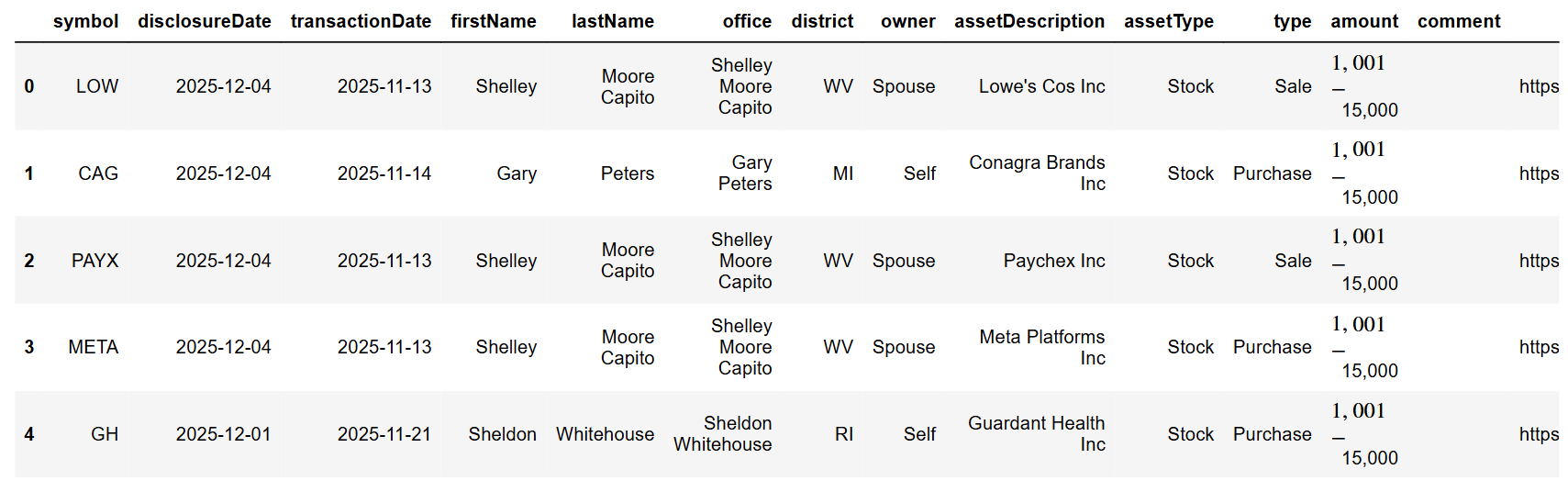
Next, the API is the Latest House Financial Disclosures API.
|
url = f'https://financialmodelingprep.com/stable/house-latest' querystring = {"apikey":token, "limit": 1000, "page":10} resp = requests.get(url, querystring).json() df = pd.DataFrame(resp) df |
The logic with limit and page as parameters is exactly the same as the first one. So let's get straight into fetching all the disclosures from the beginning of the year!
|
def fetch_api_data_to_dataframe(base_url, page_size, min_date): min_date = pd.to_datetime(min_date) all_data = pd.DataFrame() page = 0 has_more_data = True while has_more_data: querystring = {"apikey":token, "limit": page_size, "page":page} data = requests.get(base_url, querystring).json() if not data: break page_df = pd.DataFrame(data) all_data = pd.concat([all_data, page_df], ignore_index=True) # Check min date in this page page_min_date = pd.to_datetime(page_df['disclosureDate']).min() if page_min_date < min_date: break page += 1 time.sleep(0.1) return all_data page_size = 250 min_date = '2025-01-01' df_house = fetch_api_data_to_dataframe('https://financialmodelingprep.com/stable/house-latest', page_size, min_date) df_house['Body'] = 'House' df_senate = fetch_api_data_to_dataframe('https://financialmodelingprep.com/stable/senate-latest', page_size, min_date) df_senate['Body'] = 'Senate' df = pd.concat([df_house, df_senate], ignore_index=True) df['disclosureDate'] = pd.to_datetime(df['disclosureDate']) df['transactionDate'] = pd.to_datetime(df['transactionDate']) df = df[df['transactionDate'] > pd.to_datetime(min_date)] df |
You will notice that we set the page size to 250. This appears to be the maximum number the response can return. Practically, with this code, we will call both APIs until we start receiving dates earlier than our minimum date. Then, we will discard all trades before that date.
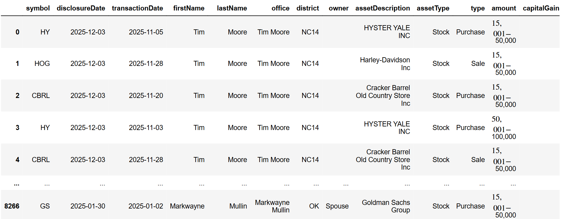
At the time of writing this article, the total number of trades we recorded was around 7,500. Upon further examination of the dataset, we will perform some cleaning.
First, you will notice that the amount of the trades disclosed is in tranches: 0 to 1,000 dollars, 1,000 to 15,000, etc. So, we will create a new column called “amountValue” that will contain a numerical value, which is the average of the tranche itself.
|
mapping = { '$0 - $1,000': 500, '$1,001 - $15,000': 8_000, '$15,001 - $50,000': 32_500, '$50,001 - $100,000': 75_000, '$100,001 - $250,000': 175_000, '$250,001 - $500,000': 375_000, '$500,001 - $1,000,000': 750_000, '$1,000,001 - $5,000,000': 3_000_000, } df['amountValue'] = df['amount'].map(mapping) df |
Additionally, we noticed that the type of trade can be more than just Purchase and Sale. Therefore, we will also map the values to “Purchase” and “Sale” for easier analysis.
|
type_mapping = { 'Sale (Full)': 'Sale', 'Sale (Partial)': 'Sale', 'Exchange': 'Sale', 'receive': 'Purchase' } df['type'] = df['type'].map(type_mapping).fillna(df['type']) |
Before starting our analysis, it would be beneficial to include the sector of the traded stock in the dataset. We will do this using the FMP's Company Profile Data API. At the end of the script, we will remove all rows where the sector was not retrieved. This is due to trades involving non-public assets, probable issues with the disclosure itself, etc. This way, we will have dropped around 500 trades, leaving us with 7,000, which is a substantial amount for analysis!
|
symbols = df['symbol'].unique().tolist() for symbol in symbols: try: url = 'https://financialmodelingprep.com/stable/profile' querystring = {"apikey":token, "symbol":symbol} resp = requests.get(url, querystring).json() df.loc[df['symbol'] == symbol, 'sector'] = resp[0]['sector'] except: print(f'Error fetching sector for {symbol}') df = df.dropna(subset=['sector']) df |
Buys and Sells
The first plot to create is one that visualises buying and selling activity each month.
|
def plot_buys_and_sells(df): df['transactionDate'] = pd.to_datetime(df['transactionDate']) df['month'] = df['transactionDate'].dt.to_period('M').astype(str) monthly_sums = df.groupby(['month', 'type'])['amountValue'].sum().unstack(fill_value=0) months = monthly_sums.index x_pos = np.arange(len(months)) plt.figure(figsize=(12, 6)) # Plot Purchases (green, positive, bottom position) purchase_sums = monthly_sums.get('Purchase', pd.Series(0, index=months)) plt.bar(x_pos, purchase_sums, color='green', alpha=0.8, label='Purchases', width=0.4) # Plot Sales (red, negative, top position - overlapping) sale_sums = -monthly_sums.get('Sale', pd.Series(0, index=months)) # Negative plt.bar(x_pos, sale_sums, color='red', alpha=0.8, label='Sales', width=0.4) plt.title('Monthly Purchases (Green +) vs Sales (Red -)') plt.xlabel('Month') plt.ylabel('Amount') plt.xticks(x_pos, months, rotation=45) plt.axhline(y=0, color='black', linewidth=0.8) plt.legend() plt.tight_layout() plt.show() plot_buys_and_sells(df) |
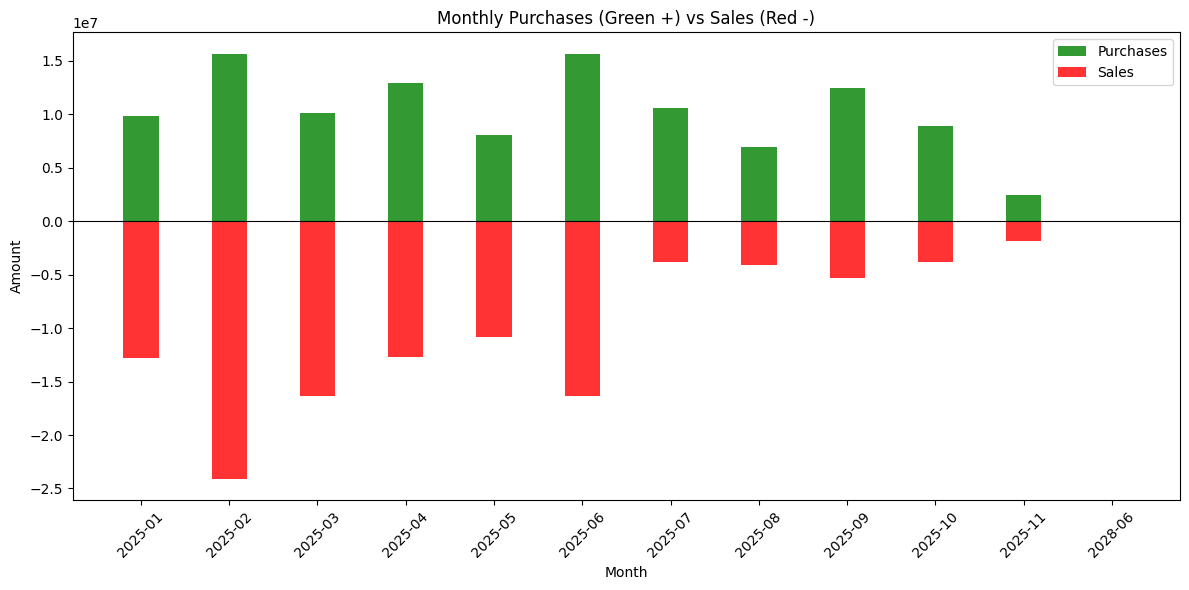
You will notice that November is not full, even though we are already in December. This is because the regulatory deadline to disclose a trade is 45 days, so trades from those months have not been disclosed yet.
From the plot, you can see that the beginning of the year was more sales-oriented, with purchases picking up later. Rather than attributing this directly to any single event, it is safer to read it as one illustration of how congressional trading patterns can shift during periods of macro and policy uncertainty.
Top traders and symbols
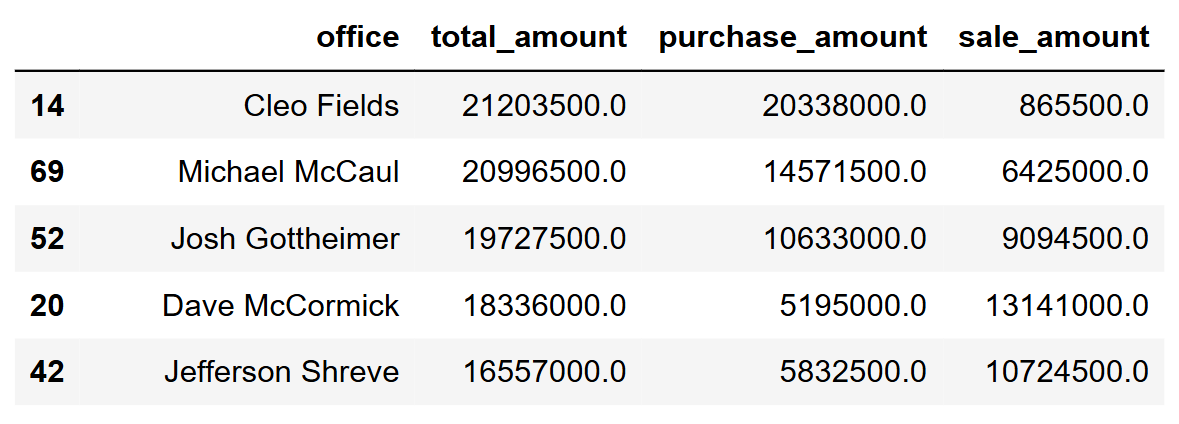
Another interesting plot is to see which members of the Senate and the House are the most active traders.
|
pivot_office = df.pivot_table(values='amountValue', index='office', columns='type', aggfunc='sum', fill_value=0) office_summary = pd.DataFrame({ 'total_amount': pivot_office.sum(axis=1), 'purchase_amount': pivot_office.get('Purchase', 0), 'sale_amount': pivot_office.get('Sale', 0) }).round(2).reset_index() office_summary = office_summary.sort_values('total_amount', ascending=False) office_summary |
Let's plot the first ten.
|
top_10 = office_summary.nlargest(10, 'total_amount').copy() fig, ax = plt.subplots(figsize=(14, 8)) y_pos = np.arange(len(top_10))[::-1] # [9,8,7,6,5,4,3,2,1,0] # Red sales first (left side) bottom = np.zeros(len(top_10)) ax.barh(y_pos, top_10['sale_amount'], 0.45, left=bottom, color='#E74C3C', label='Sales', alpha=0.9) bottom += top_10['sale_amount'] # Green purchases second (right side) ax.barh(y_pos, top_10['purchase_amount'], 0.45, left=bottom, color='#2ECC71', label='Purchases', alpha=0.9) # Customize - largest office at TOP ax.set_yticks(y_pos) ax.set_yticklabels(top_10['office'], fontsize=11) # Largest at top ax.set_xlabel('Total Amount', fontsize=12) ax.set_title('Top 10 Office by Total Volume', fontsize=14, fontweight='bold') ax.legend(loc='upper right') ax.grid(axis='x', alpha=0.3) # Add total value labels on right end for i, idx in enumerate(y_pos): row = top_10.iloc[i] total_pos = row.total_amount * 0.98 ax.text(total_pos, idx, f'${row.total_amount:,.0f}', va='center', ha='right', fontweight='bold', fontsize=10) plt.tight_layout() plt.show() |
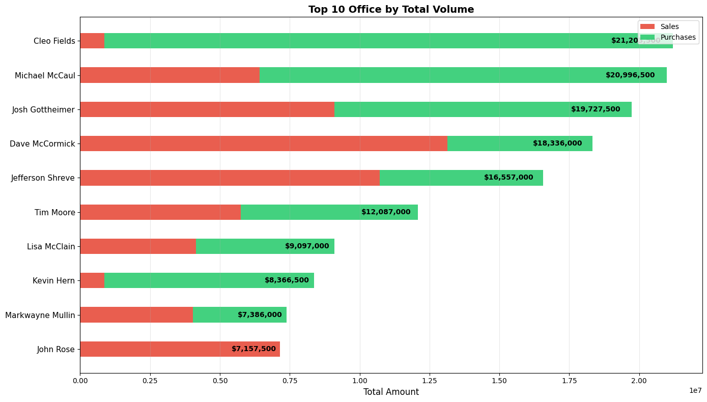
This will display the top traders, with green indicating the number of purchases they made, and red showing how many sales they conducted. Since this isn't a political article and politics aren't our strong suit, we can't comment on the names. However, it would be interesting if we knew the party affiliation of each member of the House!
Now let's do the same with stock.
|
pivot_symbol = df.pivot_table(values='amountValue', index='symbol', columns='type', aggfunc='sum', fill_value=0) symbol_summary = pd.DataFrame({ 'total_amount': pivot_symbol.sum(axis=1), 'purchase_amount': pivot_symbol.get('Purchase', 0), 'sale_amount': pivot_symbol.get('Sale', 0) }).round(2).reset_index() symbol_summary = symbol_summary[symbol_summary['symbol'] != ''] symbol_summary = symbol_summary.sort_values('total_amount', ascending=False) top_10 = symbol_summary.nlargest(10, 'total_amount').copy() fig, ax = plt.subplots(figsize=(14, 8)) y_pos = np.arange(len(top_10))[::-1] # Red sales first (left side) bottom = np.zeros(len(top_10)) ax.barh(y_pos, top_10['sale_amount'], 0.45, left=bottom, color='#E74C3C', label='Sales', alpha=0.9) bottom += top_10['sale_amount'] # Green purchases second (right side) ax.barh(y_pos, top_10['purchase_amount'], 0.45, left=bottom, color='#2ECC71', label='Purchases', alpha=0.9) ax.set_yticks(y_pos) ax.set_yticklabels(top_10['symbol'], fontsize=11) # Largest at top ax.set_xlabel('Total Amount', fontsize=12) ax.set_title('Top 10 Symbols by Total Volume', fontsize=14, fontweight='bold') ax.legend(loc='upper right') ax.grid(axis='x', alpha=0.3) for i, idx in enumerate(y_pos): row = top_10.iloc[i] total_pos = row.total_amount * 0.98 ax.text(total_pos, idx, f'${row.total_amount:,.0f}', va='center', ha='right', fontweight='bold', fontsize=10) plt.tight_layout() plt.show() |
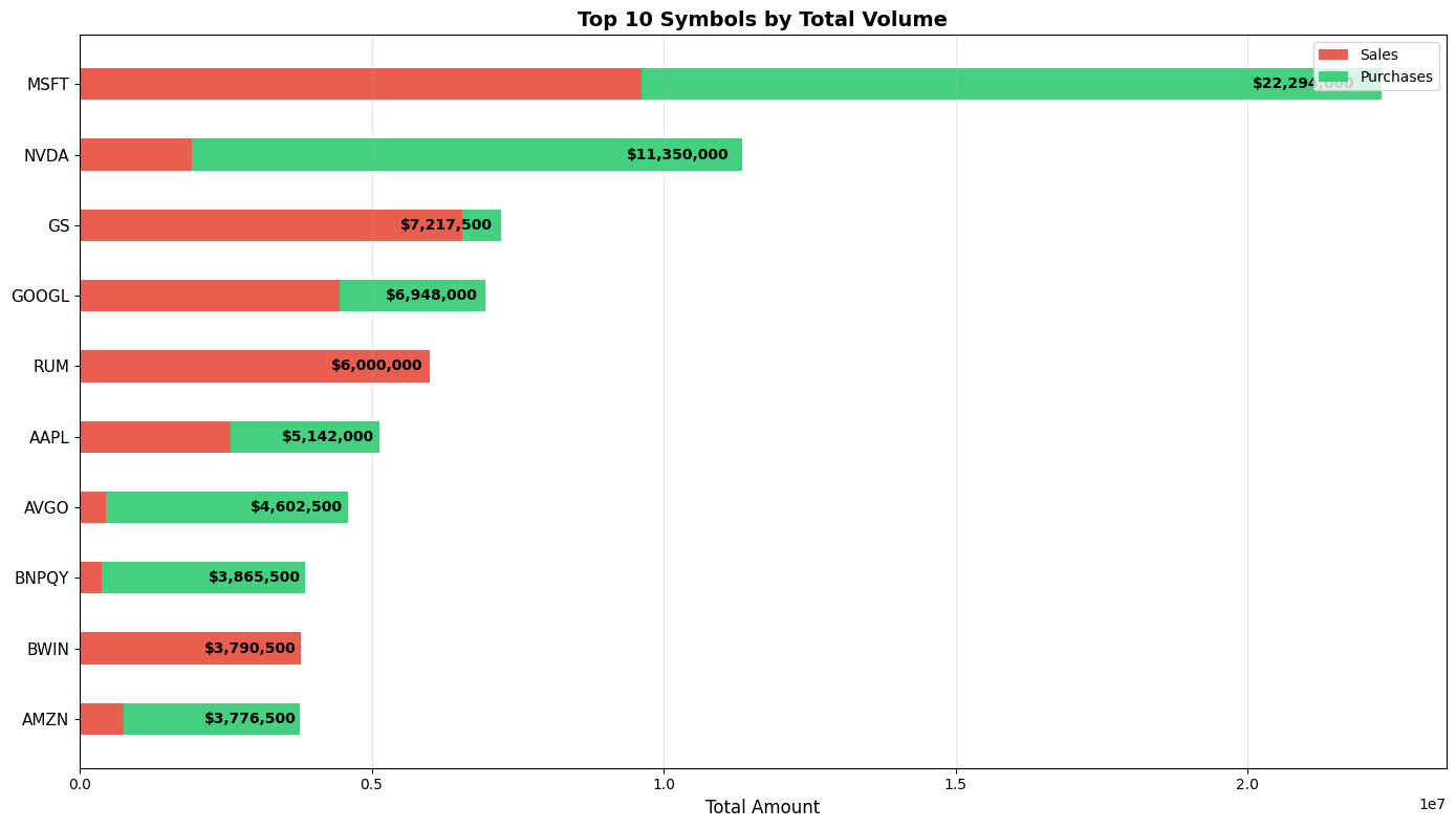
We can see that Microsoft and NVIDIA are the ones leading the trading path. What is interesting is that Goldman Sachs is third, with almost all of the trades being sales!
What about Sector?
It would also be interesting to visualise the trades of a specific sector on the same plot as the sector's performance. We will do that for Technology. FMP has this endpoint that will be handy, and it is called Historical Market Sector Performance API.
|
sector = 'Technology' from_date = '2025-01-01' to_date = '2025-12-31' url = 'https://financialmodelingprep.com/stable/historical-sector-performance' querystring = {"apikey":token, "sector": sector, "from": from_date, "to": to_date} resp = requests.get(url, querystring).json() df_sector_performance = pd.DataFrame(resp) df_sector_performance |
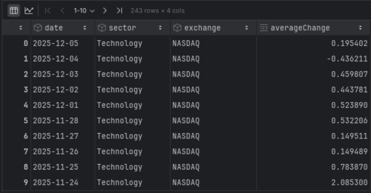
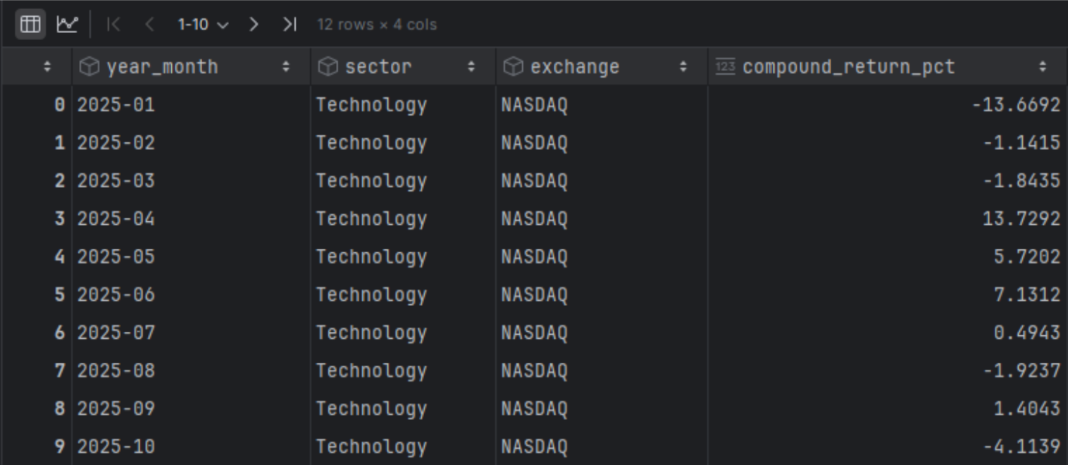
You will notice that it provides a daily change. To make it easier for us to plot, we will convert it to a change per month. For this, we should apply a compound calculation.
|
df_sector_performance['date'] = pd.to_datetime(df_sector_performance['date']) df_sector_performance = df_sector_performance.sort_values('date').reset_index(drop=True) df_sector_performance['year_month'] = df_sector_performance['date'].dt.to_period('M') df_sector_performance['daily_return_factor'] = 1 + df_sector_performance['averageChange'] / 100 monthly_compound = (df_sector_performance.groupby(['year_month', 'sector', 'exchange'])['daily_return_factor'] .prod() .sub(1) .mul(100) .round(4)) monthly_compound.name = 'compound_return_pct' # Combine results df_monthly_sector_perfromance = pd.concat([monthly_compound], axis=1).reset_index() df_monthly_sector_perfromance['year_month'] = df_monthly_sector_perfromance['year_month'].astype(str) df_monthly_sector_perfromance |
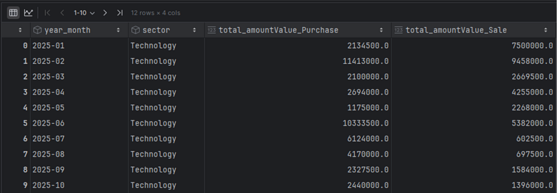
Now we will also group the trades of the specific sector from our initial dataset.
|
df_trades = df[df['sector'] == sector].copy() df_trades['year_month'] = df_trades['transactionDate'].dt.strftime('%Y-%m') sector_monthly = df_trades.groupby(['year_month', 'sector', 'type']).agg({ 'amountValue': 'sum' }).rename(columns={ 'amountValue': 'total_amountValue' }).reset_index() # Pivot to get separate columns for Purchase and Sale pivot_sector = sector_monthly.pivot_table( index=['year_month', 'sector'], columns='type', values=['total_amountValue'], aggfunc='sum' ).fillna(0).reset_index() # Flatten multi-level column names pivot_sector.columns = [ '_'.join(col).strip() if col[0] != 'year_month' and col[0] != 'sector' else col[0] for col in pivot_sector.columns.values ] pivot_sector = pivot_sector.sort_values(['year_month', 'sector']).reset_index(drop=True) pivot_sector |
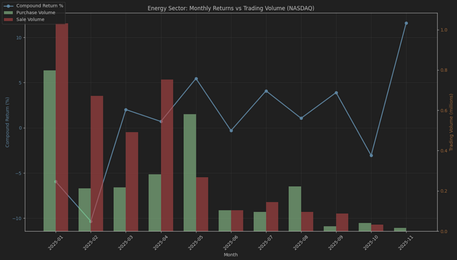
And finally, let's plot both of those results in a single graph.
|
pivot_sector = pivot_sector.sort_values('year_month') df_monthly_sector_perfromance = df_monthly_sector_perfromance.sort_values('year_month') merged = pivot_sector.merge( df_monthly_sector_perfromance[['year_month', 'compound_return_pct']], on='year_month', how='inner' ) x = np.arange(len(merged)) width = 0.35 fig, ax1 = plt.subplots(figsize=(14, 8)) ax1.plot( x, merged['compound_return_pct'], color='tab:blue', marker='o', linewidth=2, label='Compound Return %' ) ax1.set_ylabel('Compound Return (%)', color='tab:blue') ax1.tick_params(axis='y', labelcolor='tab:blue') ax1.grid(True, alpha=0.3) # second axis: grouped bars on same x ax2 = ax1.twinx() ax2.bar( x - width/2, merged['total_amountValue_Purchase'] / 1e6, width, label='Purchase Volume', color='green', alpha=0.7 ) ax2.bar( x + width/2, merged['total_amountValue_Sale'] / 1e6, width, label='Sale Volume', color='red', alpha=0.7 ) ax2.set_ylabel('Trading Volume (millions)', color='tab:orange') ax2.tick_params(axis='y', labelcolor='tab:orange') ax1.set_xticks(x) ax1.set_xticklabels(merged['year_month'], rotation=45) ax1.set_xlabel('Month') lines, labels = ax1.get_legend_handles_labels() bars, bar_labels = ax2.get_legend_handles_labels() fig.legend(lines + bars, labels + bar_labels, loc='upper left') plt.title(f'{sector} Sector: Monthly Returns vs Trading Volume (NASDAQ)') plt.tight_layout() plt.show() |

If you wish to examine other sectors, simply change the variable “sector” and re-run the code. For example, by just modifying the line of code below to Energy.
|
sector = 'Energy' |
You will get the plot below:
What about Single Stocks?
Another interesting plot would be to display a stock's price chart and highlight the trades disclosed for that stock on the same graph. First, we will use the FMP's Stock Chart Light API to retrieve the historical closing prices for Microsoft.
|
symbol = 'MSFT' from_date = '2025-01-01' to_date = '2025-12-31' url = 'https://financialmodelingprep.com/stable/historical-price-eod/light' querystring = {"apikey":token, "symbol": symbol, "from": from_date, "to": to_date} resp = requests.get(url, querystring).json() df_stock_chart = pd.DataFrame(resp) df_stock_chart.to_csv('df_stock_chart.csv', index=False) df_stock_chart['date'] = pd.to_datetime(df_stock_chart['date'], format='%Y-%m-%d') df_stock_chart = df_stock_chart.sort_values('date') |
Using these prices, we will plot the price and illustrate the trades from the dataset with green and red arrows. To reduce noise, we will only include trades exceeding 50K USD.
|
df_stock_chart['date'] = pd.to_datetime(df_stock_chart['date']).dt.normalize() df['transactionDate'] = pd.to_datetime(df['transactionDate']).dt.normalize() symbol = df_stock_chart['symbol'].iloc[0] stock = df_stock_chart[df_stock_chart['symbol'] == symbol].copy() # disc = df[df['symbol'] == symbol].copy() disc = df[(df['symbol'] == symbol) & (df['amountValue'] > 50000)].copy() # Join disclosures to prices on the date merged = disc.merge( stock[['date', 'price']], left_on='transactionDate', right_on='date', how='inner' ) purchases = merged[merged['type'] == 'Purchase'] sales = merged[merged['type'] == 'Sale'] plt.style.use('dark_background') plt.figure(figsize=(15, 8)) plt.plot(stock['date'], stock['price'], linewidth=2, color='#7ea9ff', label='Stock Price') # Plot only if there are matched rows if not purchases.empty: plt.scatter(purchases['transactionDate'], purchases['price'], color='lime', marker='^', s=120, label='Purchases', zorder=5) if not sales.empty: plt.scatter(sales['transactionDate'], sales['price'], color='red', marker='v', s=120, label='Sales', zorder=5) plt.title(f'{symbol} Stock Price with Congressional Trading Activity') plt.xlabel('Date') plt.ylabel('Price ($)') plt.legend() plt.grid(True, alpha=0.3) plt.xticks(rotation=45) plt.tight_layout() plt.show() |
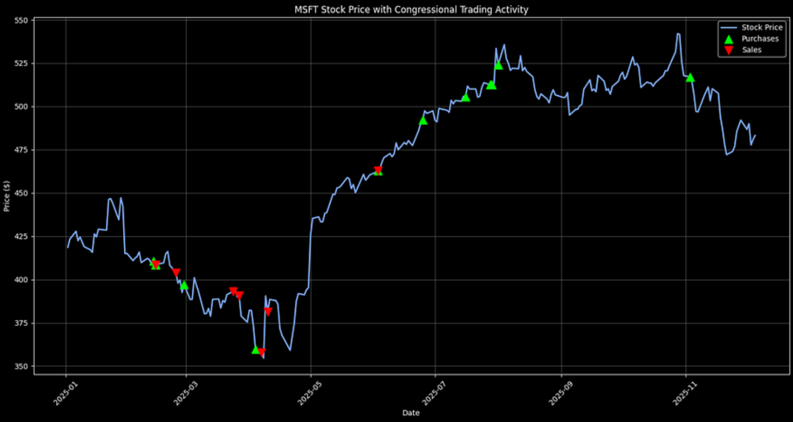
It's notable that the biggest cluster of Microsoft sales appeared earlier in the year, while purchases became more common later on. That kind of timeline view helps surface changes in behavior that might align with broader developments. Trade tensions were certainly a theme during this stretch, but it's worth being cautious about linking those patterns to any single event without more evidence.
If you want to view other stocks, simply change the symbol to the one of your choice. Let's do that for NVIDIA, which is interesting.
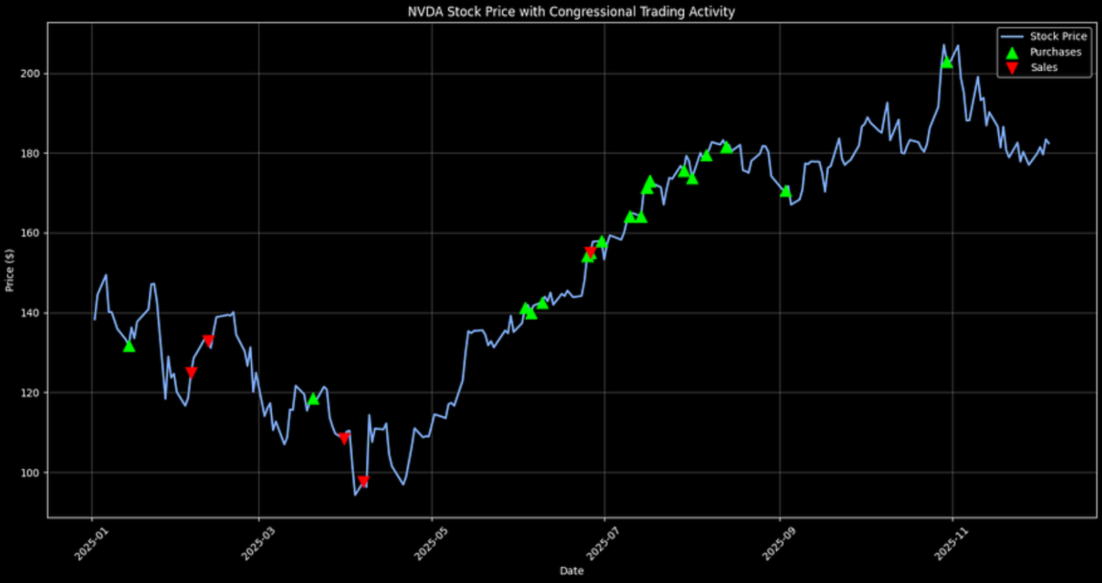
In NVIDIA's case, disclosed trading activity tilts more toward purchases over the period shown. Again, this should be treated as a descriptive signal, not as proof of insider foresight or a standalone investment thesis.
Final Thoughts
FMP APIs provide access to congressional trading data for analysis, going beyond dashboards. Identify patterns such as pre-Trump trade activities and trades made during resolutions. You can extend the code to set up real-time alerts or backtest “politician portfolios” against the S&P 500 and get a competitive advantage.
There are also other ways to improve the above analysis. You can include party affiliations, ML trade predictions, or legislative calendar overlays. In any case, we should assume no insider knowledge, but who knows.
Lastly, please know that the STOCK Act promotes greater accountability. However, the 45-day delays and tranche estimates can obscure details. It is essential to interpret public disclosures as they are, without assuming insider knowledge. Use this analysis as a guide to advocate for reforms, all while trading transparently and ethically amid ongoing debates.

Top 5 Defense Stocks to Watch during a Geopolitical Tension
In times of rising geopolitical tension or outright conflict, defense stocks often outperform the broader market as gove...

Circle-Coinbase Partnership in Focus as USDC Drives Revenue Surge
As Circle Internet (NYSE:CRCL) gains attention following its recent public listing, investors are increasingly scrutiniz...

LVMH Moët Hennessy Louis Vuitton (OTC:LVMUY) Financial Performance Analysis
LVMH Moët Hennessy Louis Vuitton (OTC:LVMUY) is a global leader in luxury goods, offering high-quality products across f...