FMP
How to Use EMA, Google Sheets, and FMP’s Technical Indicators to Forecast the Strength of the Trend
Jun 03, 2025(Last modified: Nov 19, 2025)
If you're looking to understand where a stock price might be headed, the Exponential Moving Average (EMA) is a handy tool. It's a line on a chart that smooths out price changes to help you spot trends and gauge how strong they are. By focusing on daily close prices and daily EMA data, you can get a clearer picture of a stock's trend strength. In this article, I'll explain in simple terms what EMA is, how to use it to forecast trend strength using FMP's EMA indicator and Google Sheets.
What Is EMA?
The Exponential Moving Average (EMA) is a type of moving average that gives more weight to recent prices, making it quicker to react to price changes than a Simple Moving Average (SMA). Think of it like a trend line that follows the stock's daily closing prices but smooths out the noise to show the direction and strength of the trend.
For example, a 21-day EMA looks at the last 21 days of closing prices but cares more about yesterday's price than the price from three weeks ago. This makes it great for spotting trends in daily stock data.
Why Use EMA to Forecast Trend Strength?
EMA helps you answer two big questions:
- Is the stock trending up, down, or sideways?
- How strong is that trend?
By looking at daily closing prices and EMA data, you can see if a stock's trend is gaining steam, losing momentum, or about to change direction. It's not perfect for predicting exact prices, but it's awesome for understanding trend strength.
How to Use EMA to Forecast Trend Strength
Here are five simple ways to use EMA with daily close prices to gauge a stock's trend strength:
1. Check the EMA's Slope
The slope of the EMA line tells you how strong the trend is:
- Steep upward slope: The stock is in a strong uptrend (bullish).
- Steep downward slope: The stock is in a strong downtrend (bearish).
- Flat slope: The trend is weak, or the stock is moving sideways.
How to do it: Look at a chart with, say, a 21-day EMA. If the line is climbing sharply, the uptrend is strong. If it's flat, the stock might be stuck or ready to change direction.
2. Compare the Price to the EMA
Where the stock's daily closing price sits compared to the EMA shows trend strength:
- Price above EMA: If the daily close is consistently above the EMA, the stock is in a bullish trend. The farther above, the stronger the trend.
- Price below EMA: If the close is below the EMA, it's a bearish trend. A big gap below signals a strong downtrend.
- Price near EMA: If the price hovers around the EMA, the trend is weak or uncertain.
How to do it: On a chart, check if the daily closing price is above, below, or close to the EMA. A price far above a 21-day EMA suggests a powerful uptrend.
3. Use Two EMAs for Crossovers
Using two EMAs with different time periods (e.g., 9-day and 21-day) can show trend strength through “crossovers”:
- Bullish crossover: When the 9-day EMA crosses above the 21-day EMA, it's a sign of a strengthening uptrend.
- Bearish crossover: When the 9-day EMA crosses below the 21-day EMA, it signals a strengthening downtrend.
- Trend strength: After a crossover, if the two EMAs move farther apart, the trend is getting stronger. If they start coming closer, the trend is weakening.
How to do it: Plot a 9-day and 21-day EMA on your chart. Watch for the shorter EMA crossing the longer one and check how far apart they move afterward.
4. EMA as Support or Resistance
The EMA can act like a “floor” or “ceiling” for the stock price:
- Support in an uptrend: If the daily closing price keeps bouncing off the EMA (e.g., 21-day) without falling below it, the uptrend is strong.
- Resistance in a downtrend: If the price keeps hitting the EMA from below but can't break above, the downtrend is strong.
How to do it: Look at how the daily close interacts with the EMA. If the price touches a 21-day EMA in an uptrend and bounces up, it shows the trend is holding strong.
5. Spot Divergences
Sometimes, the price and EMA tell different stories, which can hint at a trend's strength fading:
- Bearish divergence: If the daily closing price makes higher highs but the EMA flattens or slopes down, the uptrend is losing steam.
- Bullish divergence: If the price makes lower lows but the EMA flattens or slopes up, the downtrend is weakening.
How to do it: Compare the price's highs and lows to the EMA's direction. If they don't match, the trend might be about to reverse.
Step-by-Step Guide to Using EMA on Google Sheets with FMP's Technical Indicators endpoint.
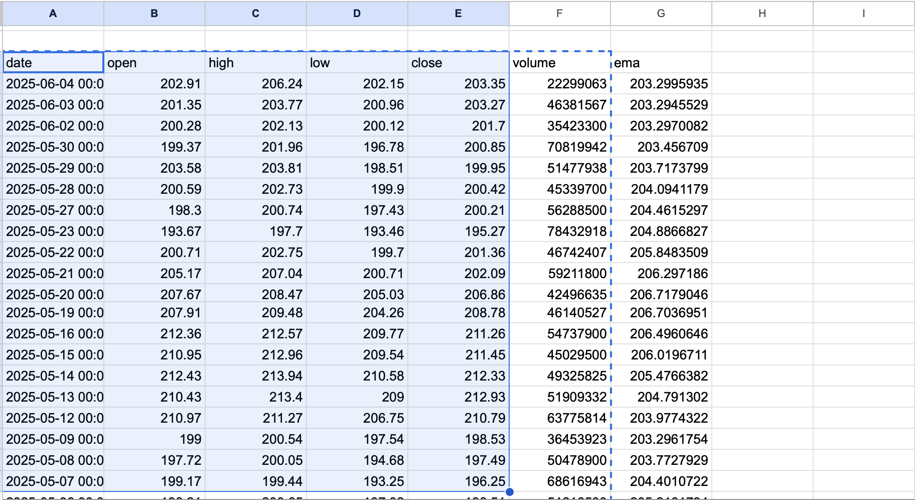
First connect FMP with Google Sheets using the instructions. After connecting everything and obtaining your custom API key, it's time to start using the FMP's Technical Indicators endpoint. Prepare a table with period (for EMA period), type ( this will be EMA. You can choose other indicators such as WMA, RSI, ADX for example), ticker (for your desired stock), time (1min | 5min | 15min | 30min | 1hour | 4hour | daily) and a range from and to so that you can extract values such as closing prices and EMA for the range.
After that, go to an empty cell and use this formula “=fmpTechnicalIndicator(G2,H2,I2,J2,E2,F2)” as shown in the below picture. This will extract EMA values for your selected period, stock and the values from G to F are the values in our table that we created in the previous step. The example can be seen below. Place all those values inside the formula as shown on the below picture.
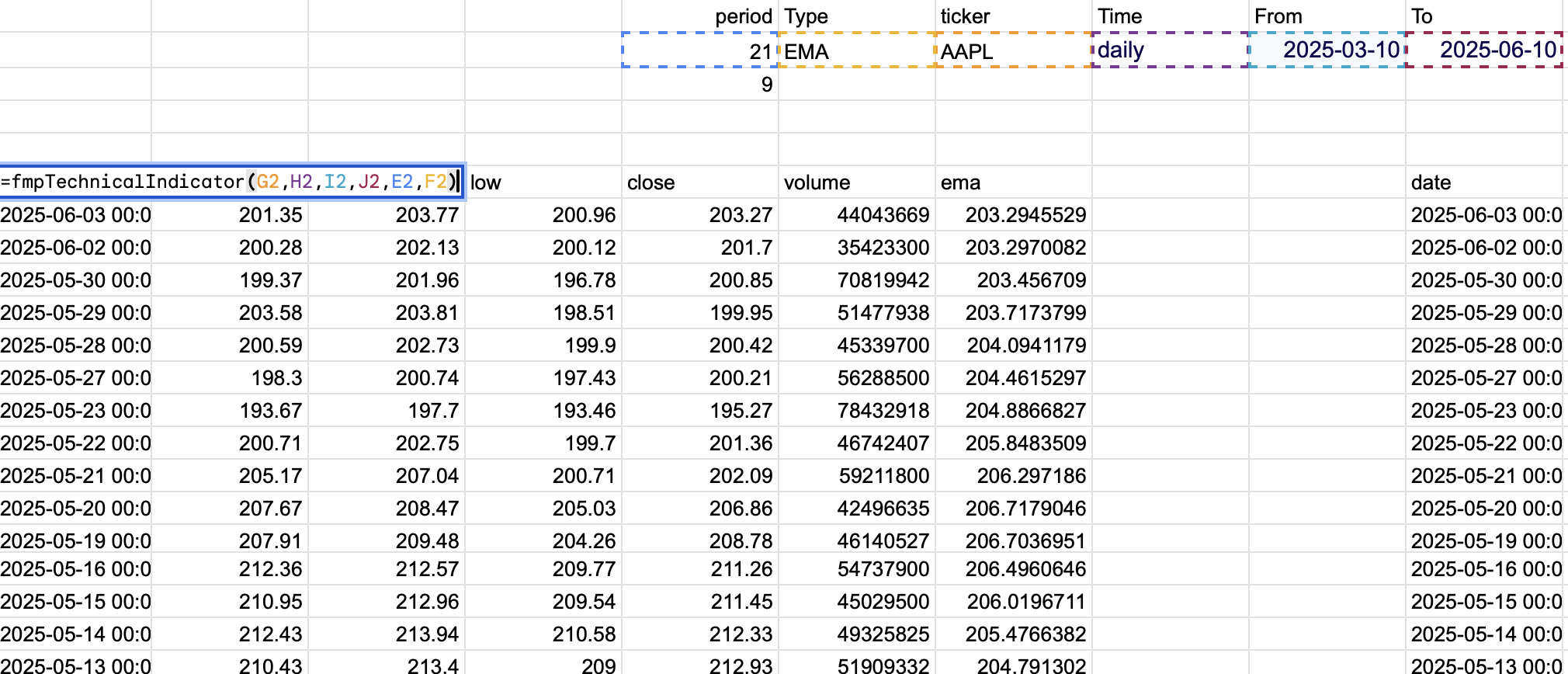
This is what you are putting inside of your formula ”fmpTechnicalIndicator(symbol, time, from, to, period, type, headers)”. After that hit the enter button and Google Sheet will extract your stock closing prices and EMA values for your identified period. Please note that the first set of data is the EMA 21.
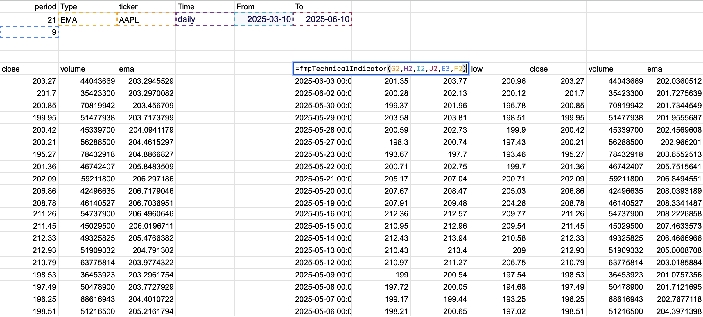
Then do the same thing but for the EMA 9. The formula will be slightly different, "=fmpTechnicalIndicator(G2,H2,I2,J2,E3,F2)”. As you can see we only replaced the period from 21 to 9 the rest of the things remain the same.
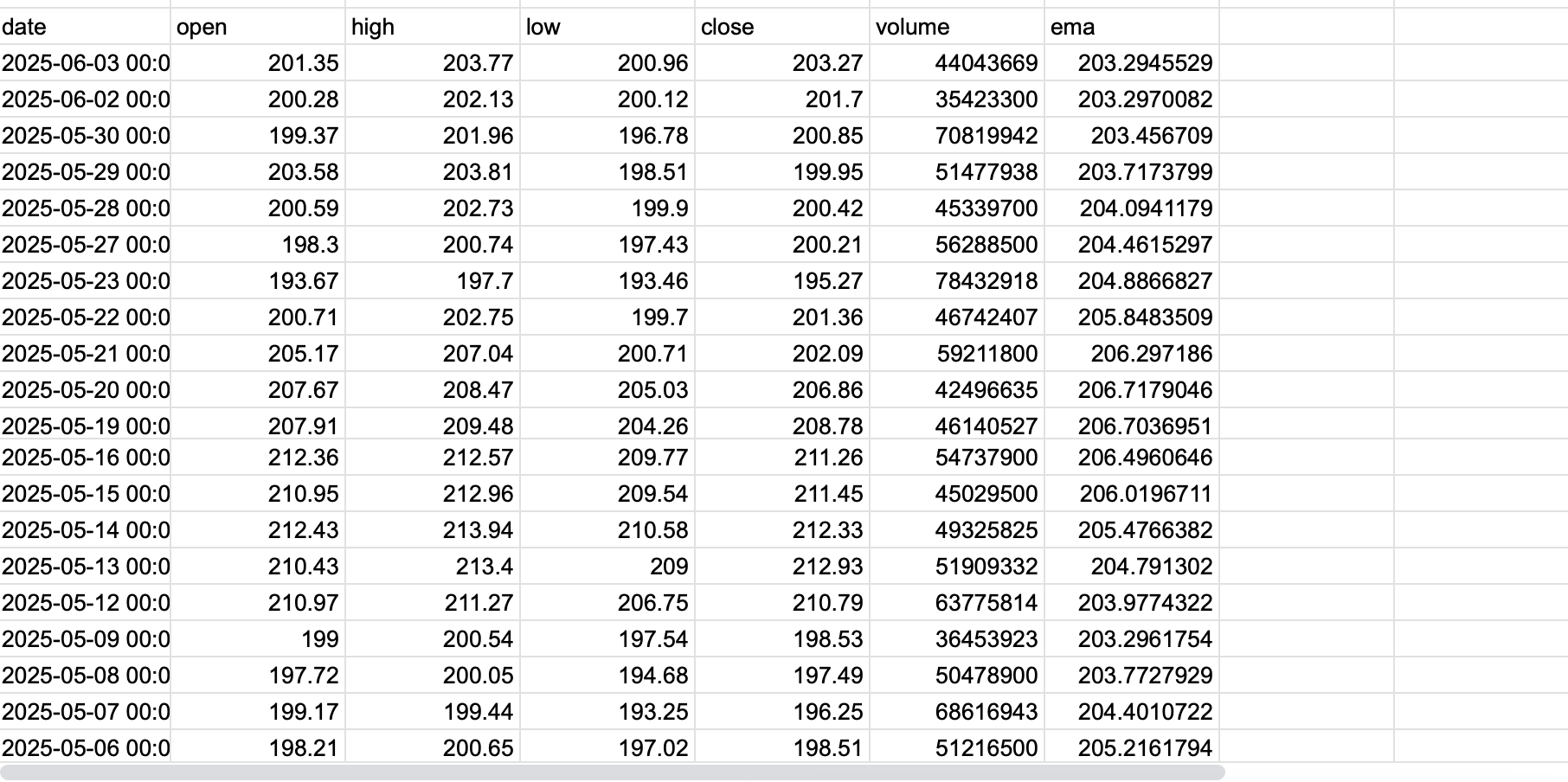
This is what you will get after hitting the enter button
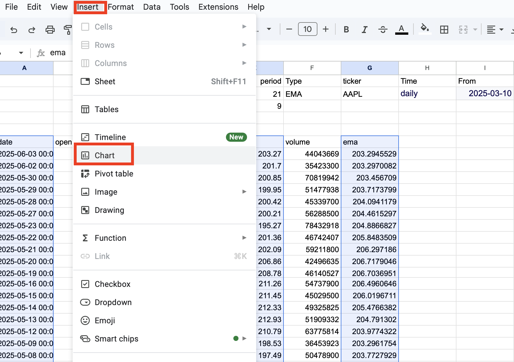
Now you have two different tables with different EMA periods. The rest of the things should stay the same. Then inside your Google sheets, choose the dataset, dates, stock closing prices, and EMA data from two tables, then go to the control panel, then choose the Insert tab and click the Chart option as shown in the below image. Change the graph settings if you want, like colors and labels, and then you will be able to see the graph.
Let's see what the graph tells us. We are taking the Apple share (AAPL) as an example.
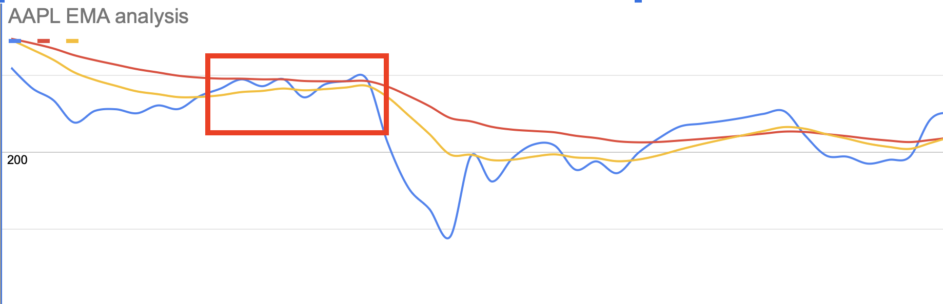
As you can see, the stock price (blue line) couldn't overpass the resistance level (red line), which is EMA21. This tells us that the stock price encountered a strong resistance level, and the selling pressure is high. As shown in the below picture.
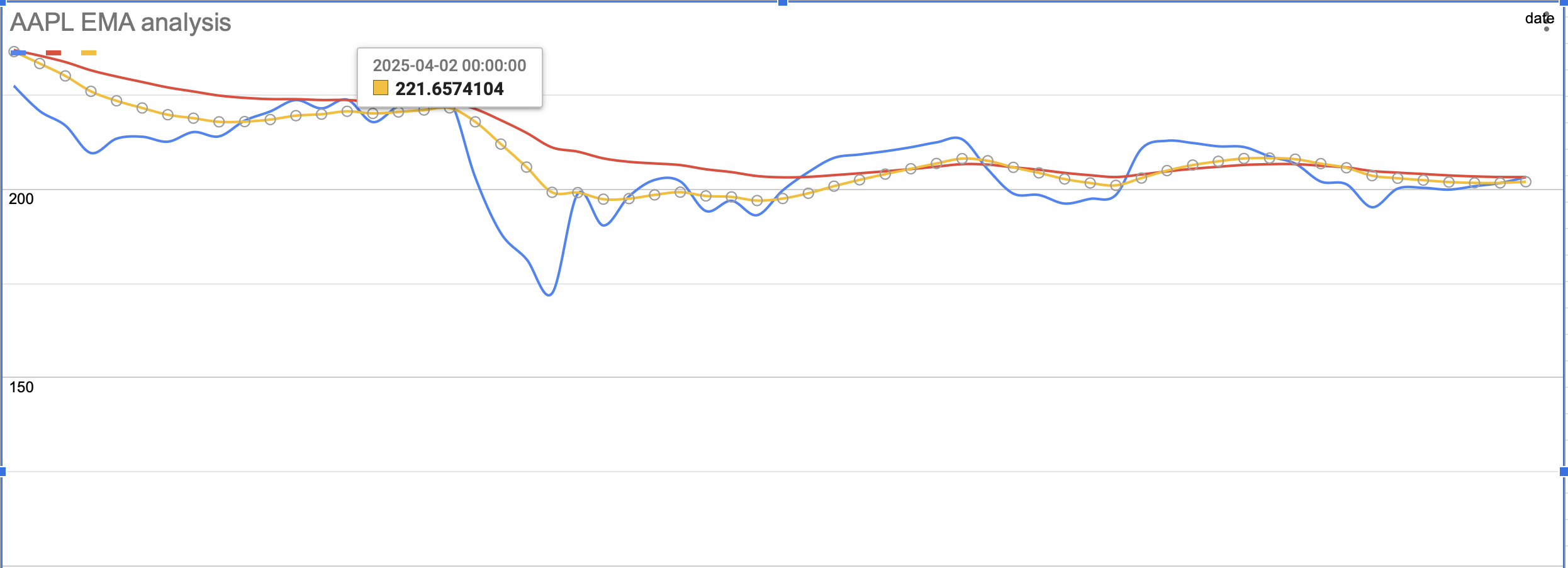
Then on the second of April, the stock crossed the EMA 9 downwards, signaling that the downside trend has started. Since the stock stayed below two EMA's, it indicated that the downside trend continued.
Then as we see on the below graph, the stock crossed both EMA's upwards, on the 23rd of April, and the upside trend has started. Since the stock stayed above both EMA's, the upside trend was strong. (Green circle). Then on the second of May (red circle), the stock crossed both EMA's downwards, signaling that the downside trend has started.
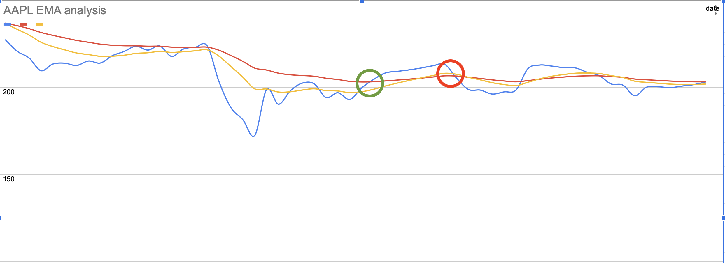
Also, as you can see, the yellow line (EMA 9) crossed the red line (21 EMA) upwards a couple of times, and the stock started going upwards more confidently. When it crossed the red line downwards, the selling pressure prevailed.
This is how you can use EMA to define the strength of the trend. You can also try to use other indicators such as VWAP or RSI that will serve you as supporting indicators in defining the strength of the trend.
Using Japanese Candlestick patterns to forecast the strength of the trend.
You can go even further and build a Japanese candlestick chart to identify different patters that can give you valuable hints on when the trend may change.
To do that, after extracting stock prices, choose that dataset as shown in the picture below.
Then on the toolbar, choose the Insert tab, then Chart as shown in the below picture.
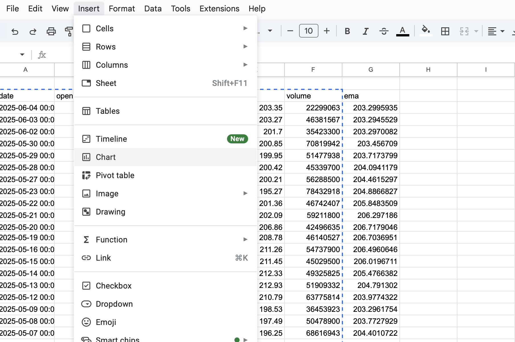
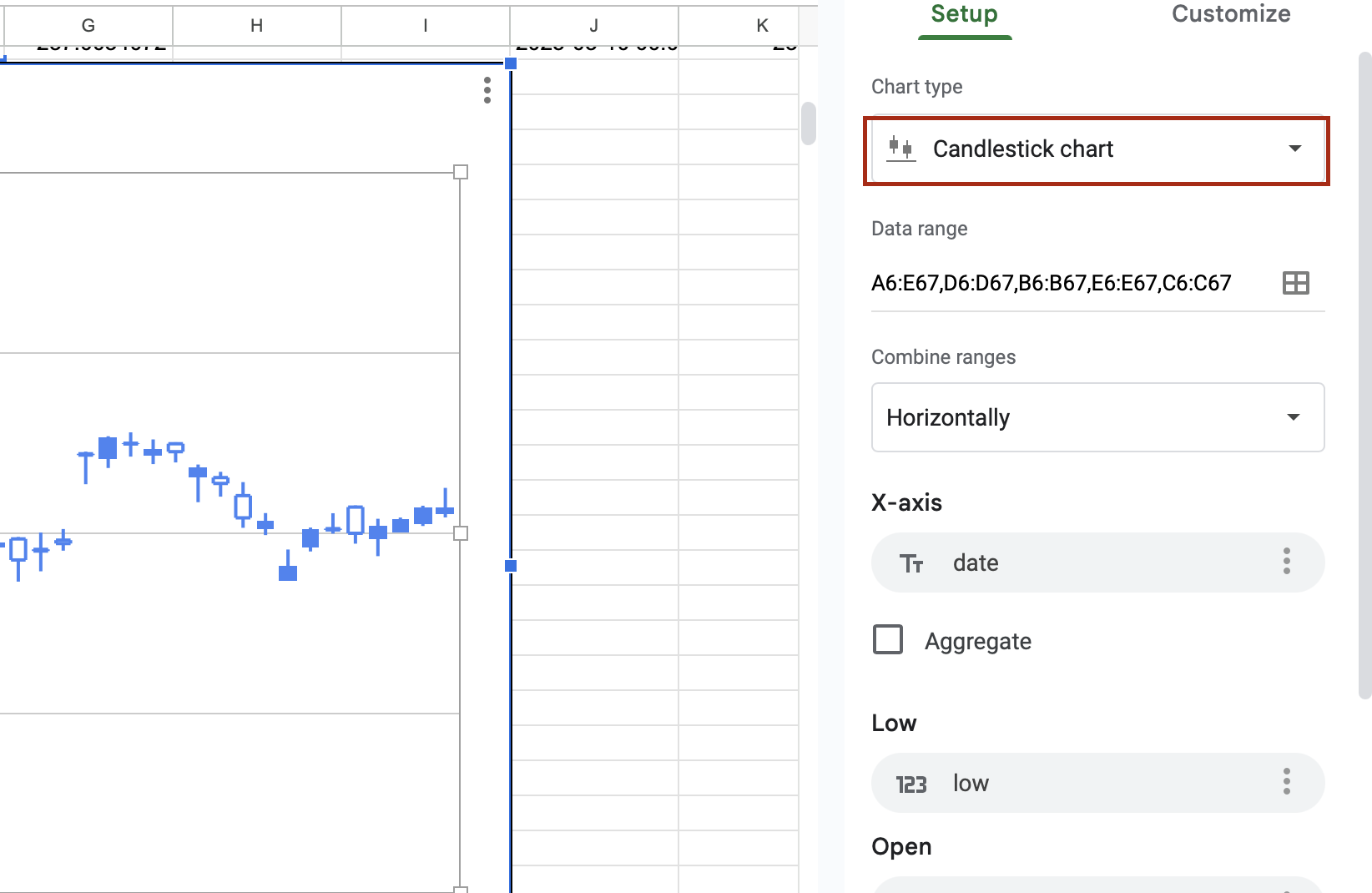
Then in the Chart settings inside the Chart type, choose the Candlestick Chart as shown in the below picture. And make sure all the values correspond to your data, lows, highs, open, and close. Then you will have a candlestick chart.
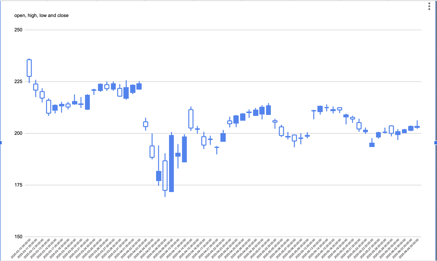
You should have a similar chart that is shown in the below picture.
Now you can use that chart to identify valuable Japanese Candlestick Patterns that will provide you with valuable hints on when the trend can change.
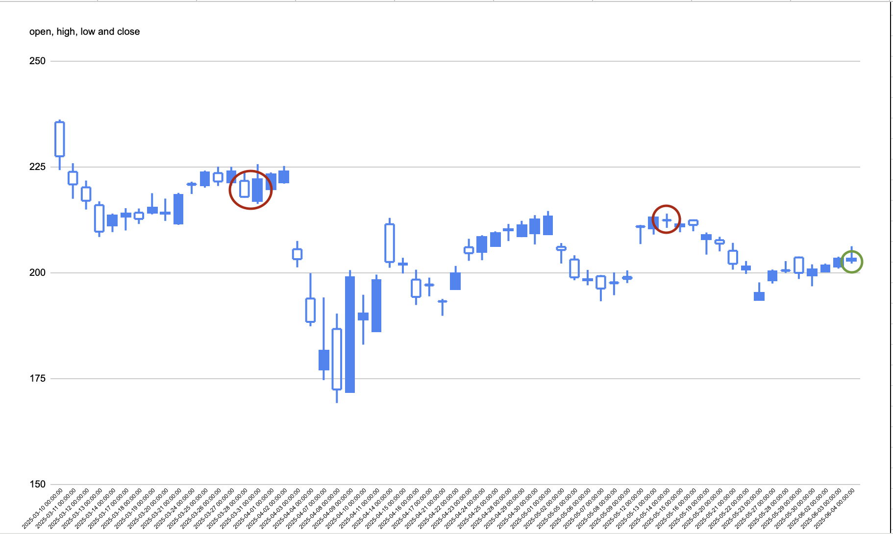
Let's look at the AAPL share as an example. I identified some valuable candlestick patters. The below image. The first pattern is Bearish Engulfing, a red circle, that tells us that the upside trend may change soon and the stock may start falling. The second valuable pattern is a doji star, a second red circle, that indicates that market participants are not sure where the market can go and you may expect a flat trend for some time. The last pattern that I want to show is a shooting star (green circle) that indicates that the rising trend may end soon. If you combine different technical indicators such as EMA or RSI with Japanese candlestick patterns, you may get more accurate signals that can give you valuable hints on when the trend may change.
I hope my guide was useful, and now you know how to use Google Sheet with FMP to extract stock prices and EMA with Japanese Candlesticks and define the strength of the trend. Now you can forecast potential spots where the stock trend can break. Please make your own research before opening positions and always consider your asset from different angles, applying both technical and fundamental analysis before taking a buy decision. Thanks for reading the article.

Top 5 Defense Stocks to Watch during a Geopolitical Tension
In times of rising geopolitical tension or outright conflict, defense stocks often outperform the broader market as gove...

Circle-Coinbase Partnership in Focus as USDC Drives Revenue Surge
As Circle Internet (NYSE:CRCL) gains attention following its recent public listing, investors are increasingly scrutiniz...

LVMH Moët Hennessy Louis Vuitton (OTC:LVMUY) Financial Performance Analysis
LVMH Moët Hennessy Louis Vuitton (OTC:LVMUY) is a global leader in luxury goods, offering high-quality products across f...